GUTSCHEIN
Bitte haben Sie einen Moment Geduld, wir legen Ihr Produkt in den Warenkorb.
Diese Produkte könnten Sie auch interessieren:
Bitte haben Sie einen Moment Geduld, wir legen Ihr Produkt in den Warenkorb.
| ISBN | 9781449362942 |
|---|---|
| Sprache | Englisch |
| Erscheinungsdatum | 22.07.2014 |
| Größe | 226 x 153 mm |
| Verlag | O'Reilly Media |
| Lieferzeit | Lieferung innerhalb von 28 Werktagen |
| Herstellerangaben | Anzeigen Libri GmbH Europaallee 1 | D-36244 Bad Hersfeld gpsr@libri.de |
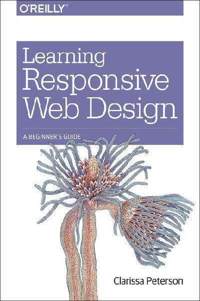
Deliver an optimal user experience to all devices—including tablets, smartphones, feature phones, laptops, and large screens—by learning the basics of responsive web design. In this hands-on guide, UX designer Clarissa Peterson explains how responsive web design works, and takes you through a responsive workflow from project kickoff to site launch.Ideal for anyone involved in the process of creating websites—not just developers—this book teaches you fundamental strategies and techniques for using HTML and CSS to design websites that not only adapt to any screen size, but also use progressive enhancement to provide a better user experience based on device capabilities such as touchscreens and retina displays.- Start with content strategy before creating a visual design- Learn why your default design should be for the narrowest screens- Explore the HTML elements and CSS properties essential for responsive web design- Use media queries to display different CSS styles based on a device's viewport width- Handle elements such as images, typography, and navigation- Use performance optimization techniques to make your site lighter and faster
| ISBN | 9781449362942 |
|---|---|
| Sprache | Englisch |
| Erscheinungsdatum | 22.07.2014 |
| Größe | 226 x 153 mm |
| Verlag | O'Reilly Media |
| Lieferzeit | Lieferung innerhalb von 28 Werktagen |
| Herstellerangaben | Anzeigen Libri GmbH Europaallee 1 | D-36244 Bad Hersfeld gpsr@libri.de |
Wie gefällt Ihnen unser Shop?